Begin with the idea
Restraint starts with knowing what matters. Before choosing a typeface or a palette, identify the central idea your brand needs to communicate. A clear idea gives you a way to assess every creative choice.
Give the details room
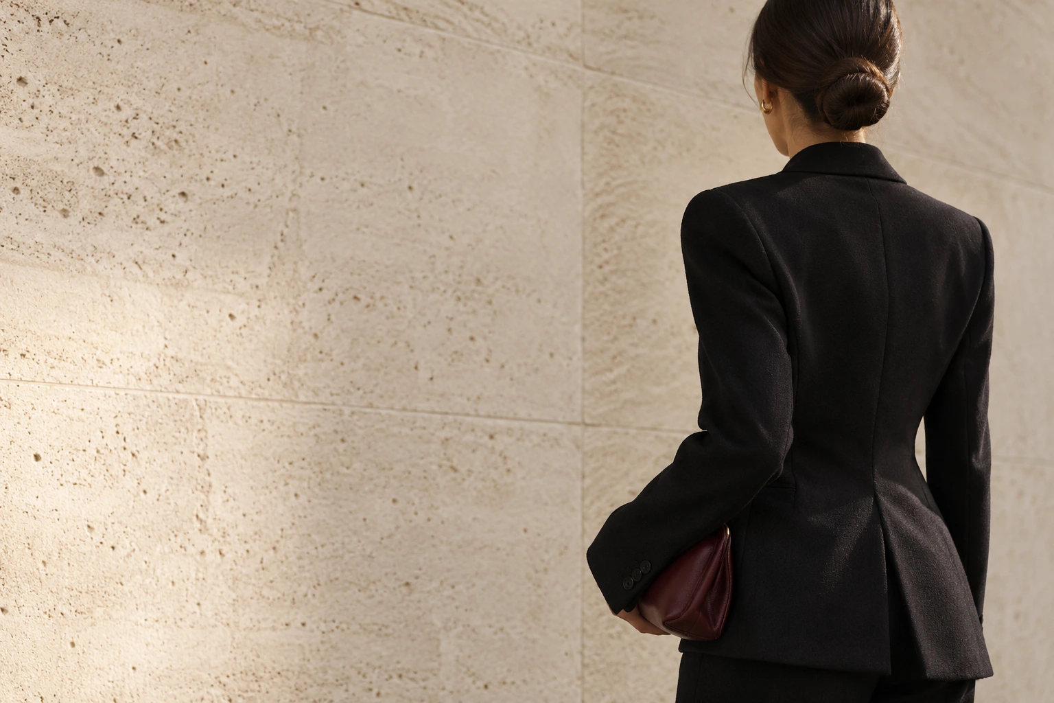
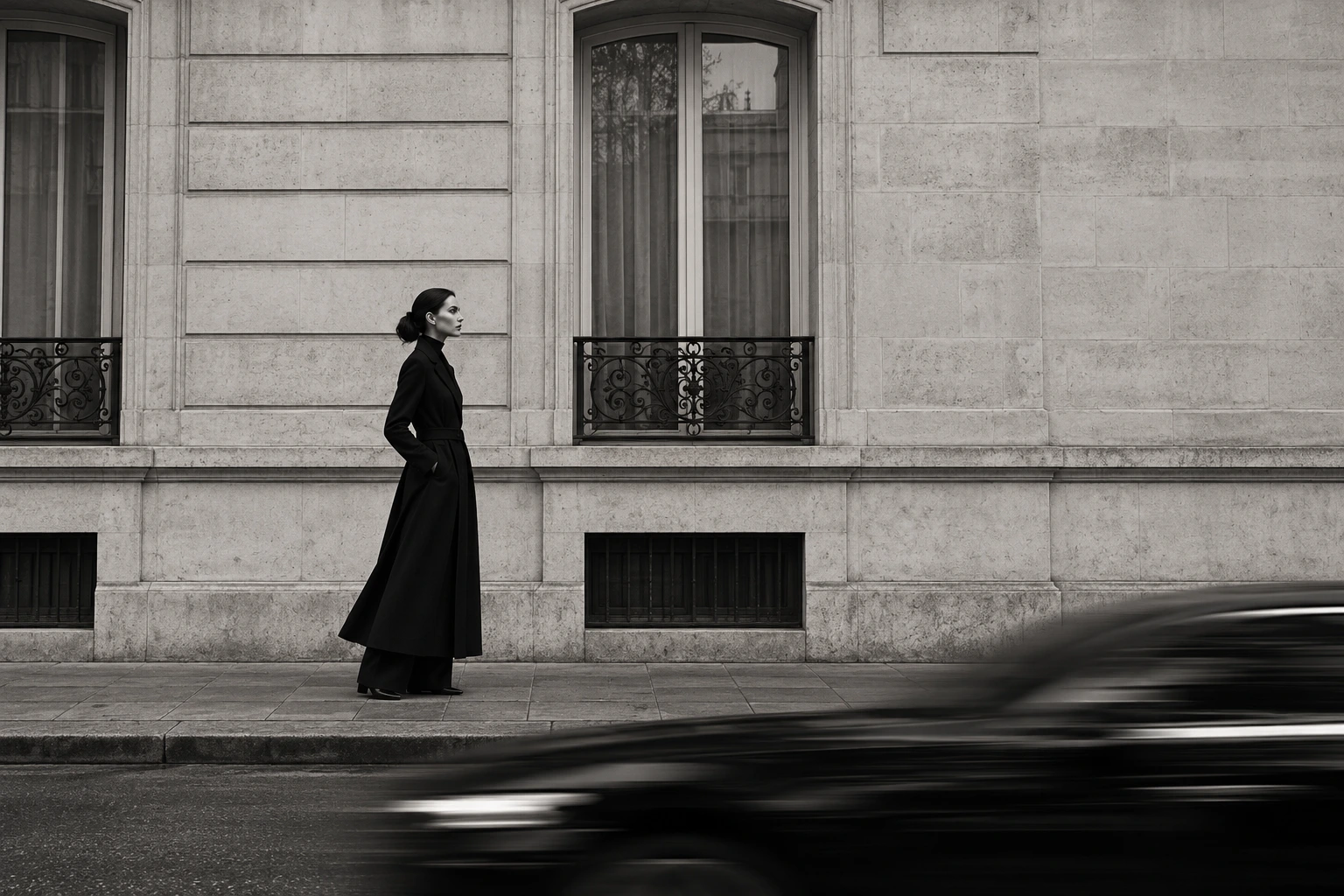
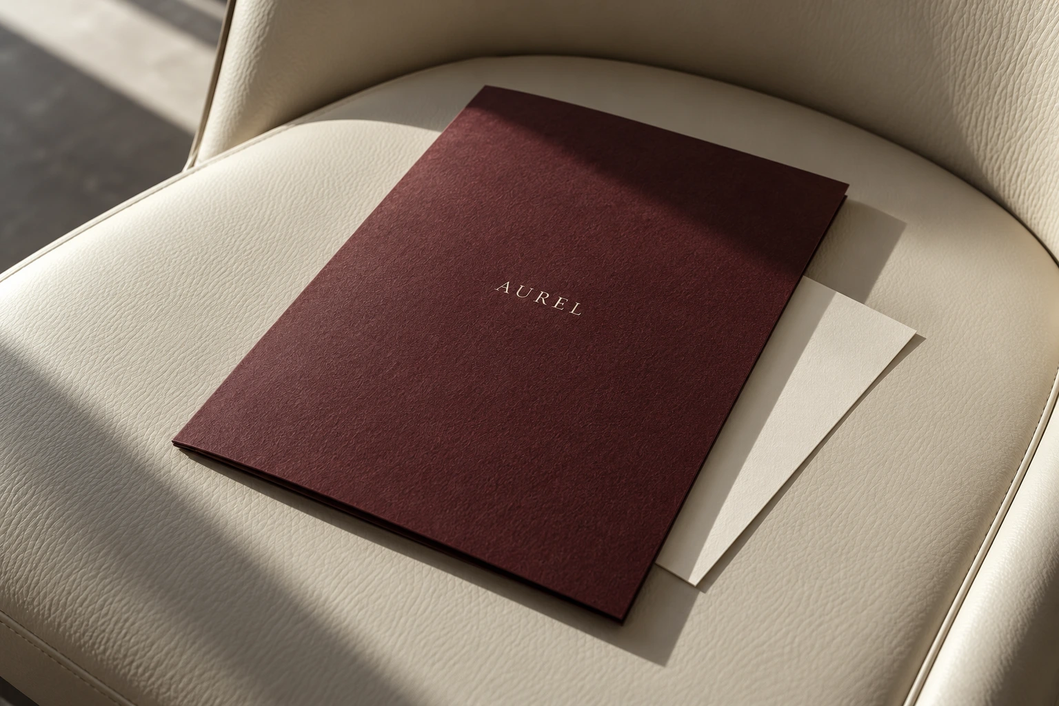
A smaller palette or a simpler layout places more emphasis on the details that remain. Proportion, spacing and material begin to do more of the work. Simplicity needs care, because each choice becomes more visible.
A clear idea gives every detail a reason to be there.
Keep character in the system
A restrained identity can still feel distinctive. An unexpected proportion, a particular tone of voice or a tactile application can give it character. The aim is to find the details that belong to your brand and repeat them with intention.
Make space for consistency
Use a few clear rules for typography, colour and imagery. A manageable system helps the brand remain coherent as new pages, products and applications are added.
Written for the Sable House concept journal. Images show illustrative creative work.